During the last year, we have thoroughly enjoyed this course, as we have learnt a lot and had fun whilst doing it. Together we have planned, researched and produced a music video for the song What I've Done by Linkin Park, and individually we each researched, planned and designed a Digipak and a poster for the album. We are all very happy with our final product's that we put lots of time and effort into producing.
If you would like to see more of our work, we all have individual Blogs, for our work as well as Blogs for our Postmodernism work, research, theories etc, We won't be posting on here any more so if you would like to visit our blogs please click the corresponding links;
I have looked at the Rule of thirds, The image below shows a Rule of Thirds grid applied to Green Day's American Idiot, during my editing of my Digipak in Photoshop.
I will upload my thoughts on Rule of thirds and how and what i've done to apply it to my Digipak/Poster, once I've completed the editing of my Digipak
At the moment our group blog is a bit messed up as we have all been posting on it at the same time and not had chance to keep it tidy, therefore this is why our evaluation and other related stuff extends past the first couple of pages, if you would like to see my evaluation in order one down to four (plus I have post my evaluation part 1 in one post) visit my blog.
I will try to sort out the blog asap, although I may not get time this weekend as I have about 10 pieces of homework to do
I'm going to discuss how my music video, digipak and my advert uses, develops or challenges forms and conventions of real media products.
First of all I will analyse/discuss my Poster.
When I was researching into designs for my poster I didn't just stick to the music industry or my genre of music for inspiration. I have looked at bands and companies such as;
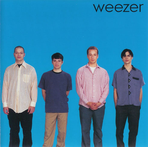
Weezer
Cadbury's
Green Day
Tinchy Stryder
Killers
McDonalds
Hard Rock Cafe
Linkin Park
When thinking about designs for the poster, I always wanted to keep it simplistic, similar to conventions rock bands such as Weezer and Green Day use. As well as I assumed that the band would be professional and popular, therefore this allowed me to
be a little more creative in how I advertised them.
As I am a big fan of the band Linkin Park and Green Day, these are two of the first bands that I looked at for inspiration, the posters that I liked the most are the following;
These two posters attracted my attention for a couple of reasons, first they are very eye catching for their individual reasons, the one on the right because of it's bright colour and Billie Joe Armstrong in a similar position to the Statue of Liberty in New York, and because it's the same picture they used on the design of their 'Bullet in a Bible' Digipak. The second one it's very simplistic, although this isn't an advert it is just a poster which relates to the 'American Idiot' album, but they have made it very simplistic and gone with the same wording and picture as they did with the album art on the corresponding album.
As for the Linkin Park advert they as well have used the picture from their album Meteora, once digging deeper into the adverts of this genre it turns out that it's common to use the album's front cover in the albums advert. This is another convention that I wanted to use as it is effective because when people see the advert they'll remember it as the bands new album, then when they look online or in shops for music to purchase they'll spot the image and recognise it as the bands new album, instead of just scrolling though new albums and not paying attention to it.
I wanted to keep it simplistic, e.g. put as little wording and pictures on it as possible but make sure that the viewer recognised it as HW's ERA, Therefore I along with the wording "NEW album released 21/1/11, Pre order on iTunes", and the bands logo, I believed this was necessary information to the readers, other famous companies and artists using this method include Tinchy Stryder, McDonalds, Cadbury, Hard Rock Cafe and Coke. The following adverts which are examples of the same companies using this type of advertisements. This is evidence to support my belief that you don't need to say a lot to get the message across. This is why on my poster I only wrote "New album released 21/1/11, pre order on iTunes" along with the bands' logo and the image from the front cover of the digipak. These three items allow for recognition of the 'brand' that HW's ERA is, I believe this works because modern artists and bands are now 'brands' to themselves and their record labels such as Dairy Milk is to Cadburys, therefore when you are shown the LP logo you would recognise it as Linkin Park's logo same for the double F logo of Foo Fighters, or a band/artist that you like. This works because of their brand awareness and brand loyalty, although they would like to capture new people into their audience all the time, the fact is within support from their genre of music or market they are normally already known and are popular therefore they can afford to use this type of advertisement and be successful with it.
I decided that I would challenge the convention of using advertisements on my advert, as I wanted to keep with the simplicity of my design, and adding more text and logos from other mediums such as NME and Kerrang wouldn't help keep it simplistic, although the band could have benefited from Synergy marketing, I believed that my poster/advert would be more successful by keeping it simplistic.
My Final piece of inspiration for both of my ancillary products was Weezer, but when it came to my poster I looked at the 'Green Album' poster (doesn't include white and black border), although they have used more text than I was looking to use they have just adapted their album cover, by adding text underneath it, the original album art. The main text that is easily readable without much acknowledgement, which posters/adverts don't normally get, says "Weezer" "the green album" "out now". I decided to use their conventions of using their digipak's front cover picture on the poster then adapt it to their needs this is why the band logo is there I decided that I need to write "HW's ERA" due to brand awareness and but I evaluated on their "out now" part and wrote that you could "pre order now from iTunes" and when the release date was.
Digipak
My digipak has taken inspiration from many places and many different artists; some include
Weezer
Green Day
Blur
Foo Fighters
Linkin Park
As I researched I found out that most album art / digipaks aren't original they are just copies from previous artists, for example the two following pictures, but this doesn't mean that I didn't want to be original in the methods that I designed my digipak, although for my front cover I took the inspiration from Weezer's ablums, they didn't actually come up with their designs by themselves they actually copied another band called (N2S: insert band name), Which actually weezer actually copied for their blue album, as using the 'blue album', the 'red album' and the green album that was produced by Weezer for inspiration, I decided that I wanted to make mine similar to their, when designing my front cover I wanted to blend and change their album to create mine, l this is why I have the four band members standing in a jaggered style one infront of another but spread out, then placed in the bottom right corner of the album, as you can see the jaggered postion that I used came from both of the red and green albums and the long/full shot of them came from the blue album. I also had them stand in different ways such as Weezer does in each album, I have them either with either their hands in pockets, arms folded or by there sides. and when it came to the time and explicit content sticker, I decided that unlike any of Weezers albums I wanted to break the convention of either having it in the centre or to the right and feature it on the left, in a bid to be original. The same is true for my inside page where the band members are sitting/standing to the right hand side under the albums name.
Although I produced a Digipak for a rock band, I challenged the convention of rock albums, as rock is known for it's use blacks and other dark colours, I decided that I didn't want to use any dark colours particularly, as I believed that I could make a Digipak for a rock band that didn't follow the convention of using dark colours, there for I used red, blue, green, white and yellow, although the majority is either red and white, I wanted to use this so that it stuck out and was eye catching.
I took inspiration from Green Day's American Idiot for my back cover, if you look at the album art below you can see that they featured a hand holding a hand grenade in the shape of a heart, which was leaking blood on the front cover and on the back they had a picture of the pin. I decided I wanted to take inspiration from this and adjust it to have just the band's logo (a grenade, with the letters HW carved into it) and place it in the top right and corner with the text flowing tightly around it. This is another convention that I broke because whilst researching I didn't find a back cover with text tightly wrapped around a logo/picture. Although I decided that I wanted to go with my original idea and produce the back cover with the text tightly wrapped around a image.
When designing my ancillary products I took into consideration the rule of thirds, which meant that using Photoshop I put a grid on my photo which basically put 3x3 square grid on my picture this then allowed me to align my pictures to the rule of thirds, therefore having my main sections of the images at the most eye catching section of the picture, as the eyes don't naturally look straight to the centre of a picture, I placed all of my pictures except for the CD design and CD case section in the most eye catching positions, to make sure that my image was eye catching as well as easy and natural to look to at the points of interest such as the grenade on the back cover or the lead singer and guitarist on the front cover. All of the points of interest on my poster and album art have been applied to the rule of thirds, Therefore the points are appear in the picture where the 'imaginary grid lines' would cross each other, these lines and crosses on the lines are where it is easy and natural to see.
Normally the singer is the centre of attention and main person the public recognise when you talk about any band not just a rock band but I decided that I wanted to challenge the convention and place the Guitarist at the centre of attention with the drummer and lead singer in equal positions behind him followed by the keyboard player, This is unusual for any band as by default, with the exception of a couple of bands such as Fall Out Boy the lead singer is the centre of attention, e.g. Dave Grohl in Foo Fighters, Hayley Williams in Paramore, but with bands who break/challenge the convention the guitarist or drummer are the centre of attention such as Pete Wentz(guitarist) out of Fall Out Boy or Phil Collins(drummer) from Genesis.
I have been inspired by Blur's "Best of:" album which was designed by Andy Warhole the famous artist, this is why I decided to do some research into art and him, whilst looking at designing my ancillary products. although originally I wanted to feature this kind of theme throughout my entire digipak, I decided against it. I did feature a copy of his blur album front cover on my digipak, it was the section where the CD would slip behind, I also wanted the CD to have the same design on it. I can only find/think of two rock band artists who use art on their album cover Green Day and Blur, therefore I wanted challenge the convention and put some 'art' in side of my digipak.
Music Video
Throughout our music video we have used and challenged conventions which are used in real media products, these conventions are;
Using Posters,
Band Logos
Band finishing Performance
Use of colours
Band members Clothing
Filming Inside
Firstly we decided that we should put the band's logo on the drum kit, for two reasons, this is what almost all bands do, but also because we believed that it would look good, which I believe it does, I actually think that although it's the same colour as the drum and the brand of the drum, it stands out.
Band members clothing, we tried to keep the band members clothing as close to what professional bands wear, such as black skinny/slim fit jeans, skater shoes/hi-tops and either a shirts or t-shirts with a statement or a design/pattern on it. Foo Fighters and Green Day are the two major bands that we based our clothing on. If you look at Billie Joe (lead singer from Green Day) and Tre Cool (Drummer from Green Day) they are wearing a black shirt, such as the one that of our drummer Rhys is wearing, although he has his sleeves rolled up, for two reasons he look better with the sleeves rolled up as prior his appearance didn't seem to quite fit the image of a rock band, and as being the drummer he needed to be able to easily move around whilst playing the drums at a high tempo, such as he does in our video.
Also for our keyboard player we wanted to challenge the convention of them being the people who wear 'normal' clothes, although as they are behind a keyboard you don't normally see their shoes/trousers as they aren't normally featured much especially in comparison to drummers, guitarist, singer and even the DJ on his decks (What I've Done music video), but we decided that we wanted Tom (keyboards) to wear a vest t-shirt but also some fingerless gloves as they allowed us to put across the image of him being a major part of our rock band unlike most keyboard players who are mainly support members of the band.
The following video displays the drummer, leader singer/guitarist and bassist wearing the same style of clothing that we decided to go with, This includes the Shirt and Vest, and the shoes.
The lead singer and the guitarist was wearing different style of clothing which reflected more to the style that is featured in Foo Fighters' "The Pretender". They both wear skinny/slim fit black jeans and a T- Shirt with a picture/Statement on them, although Darren our lead singer wears hi-tops and Dave who is the Guitarist wears a scarf and skater shoes.
We got inspiration for filming inside from the music video which is produced by Foo Fighters their song is called Monkey Wrench, Green Day's Basket Case, Paramore's Ignoracne and All American Rejects' Gives You Hell. When I was researching into music videos, I looked at loads of artists including ones I like and don't but my inspiration came from four bands that I like, although not on purpose.
All four of the bands previously mentioned use the convention of filming their band performance inside, I liked this idea, as it allowed us to do a variety of things, customise the mes en scene easily in comparison to filming out side where it would be very difficult. I like the idea of making it look as if we in our band's studio either recording or practising their song, although this isn't a widely followed convention it is still quite popular among music videos especially rock music, as exampled by the bands and videos (listed and below), Although I liked the idea of filming inside, if filmed somewhere inside else and without the posters, I don't think I would have liked it as much, because although we did film inside, we wanted it to be slightly different and not film in a house/flat such as the ones listed.
Posters
Whilst researching music video for inspiration, I watched a video from one of my favourite bands the Red Hot Chili Peppers' in their video for Dani California they pay homage to their favourite bands/artists, by dressing up/acting like they do/did, This is the similar for All Time Low in their music
video, although they don't necessarily pay homage to their favourite bands but have text in their video saying phrases such as "more like All Time Blow", instead of All Time Low and "I'd rather be watching Fall Out Boy" . These are two different types of rock music and music video's but the wording and the bands paying homage to their favourite bands/artists such as Elvis Presley, Blink 182 and Guns n' Roses. All though we knew that we wanted some thing in the background such as posters, we wasn't sure about it but after researching and see in these two music video's and a suggestion, we decided that it would be a good idea to put posters on the wall of our favourite bands, (Green Day, Foo Fighters, 30 Seconds To Mars and My Chemical Romance, unfortunately we could get a hold of a Linkin Park poster for the day of the production).
We decided to challenge the convention of having no posters in music videos but at the same time we wanted our posters to pay tribute to our favourite band.
Our music video shows members of the band finishing their performance, this is a convention that is used by numerous bands, a good example the following videos are by Green Day and My Chemical Romance.
By doing this in our music video it allowed us to emphasise that the band members were only interested in playing the music, enjoying themselves, 'relaxing' and having fun, as most bands start out as a hobby and out of enjoyment they keep practising, The very last section of our music video as demoed below, I think that the music video and this shot explains and shows that they were only interested in playing their music, this is why they have a quick set up sequence of shots and we didn't use an establishing shot in the video.
(last 15-20seconds-tubechop wouldn't allow me to cut this clip)
(last 15 seconds-tubechop wouldn't allow me to cut this clip)
It is quite often that rock bands use little colour, take the My Chemical Romance video for "Welcome To The Black Parade". We decided that the use of a colour would make our video look better, we had discussed about make our music video entirely greyscale/black and white, we even discussed which method would be best e.g. filming in colour then converting to black and white or filming with our surroundings being black and white, we even discussed maybe only us being colour and surroundings and props being greyscale but decided that filming in full colour be more effective. Also by doing this we would challenge the convention of using lots of colour, which isn't often used in the music genre our song is associated with. we also decided that we wanted to make it very bright whilst inside and then for it to be very dark when the band finish performing and leave, we discussed the opposites of brightness and darkness contrasting as rock music is associated with darkness and rebels, etc but the band are performing in a very bright conditions and then leaving to go into darkness, the stereotypical view of rock bands are that they they prefer darkness, but our music video allows us to challenge this convention.


-front.jpg)


